To follow up Deaths in Italy attributed to COVID-19:
- Click Italy on the left menu of the John Hopkins map.
- Click the Active Cases tab at the bottom center.
- Click the Daily Increase tab at the bottom right.
- Hover your mouse over the longest chart bar.
- Observe that March 20, 2020 – 17 days ago – was the peak of Italy’s daily increases in COVID-19 cases.
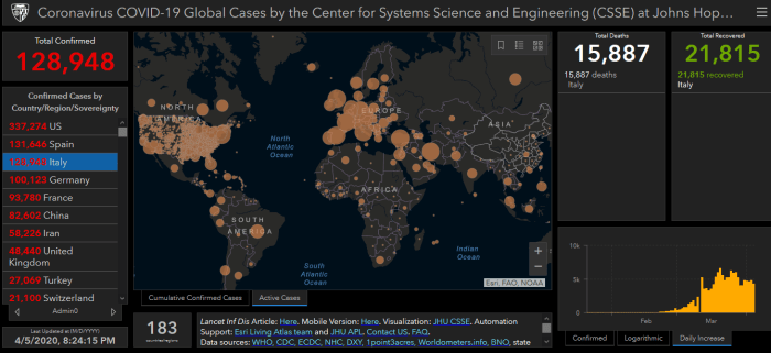
Have you seen this reported anywhere or investigated? I heard on tonight’s coronavirus task force briefing that Italy’s daily deaths had gone down. Even non-health professionals knew that should have happened – with a lag time – since March 20th.
Can you find daily deaths or daily recoveries on the map? No, John Hopkins has those daily numbers but doesn’t display them. It’s not a difficult programming task to put two more tabs at the bottom right and display daily deaths and daily recoveries.
I’ll guess the public isn’t really their customer. John Hopkins is a herder – acting on behalf of their customer(s) waiting at the bottom of the cliff – because they display cumulative deaths that panic the public toward the cliff rather than inform us.
We also know there was some other-than-medical purpose for:
“All the people who die in hospitals with the coronavirus are deemed to be dying of the coronavirus.”
although
“Only 12 per cent of death certificates have shown a direct causality from coronavirus.”
What effect would such reporting have on the headlines we’ve seen over the past 17 days?
Who has benefited from (medical, economic, social, and political) reports on and actions taken with COVID-19 over the past three weeks? Who has suffered from these reports and actions?
